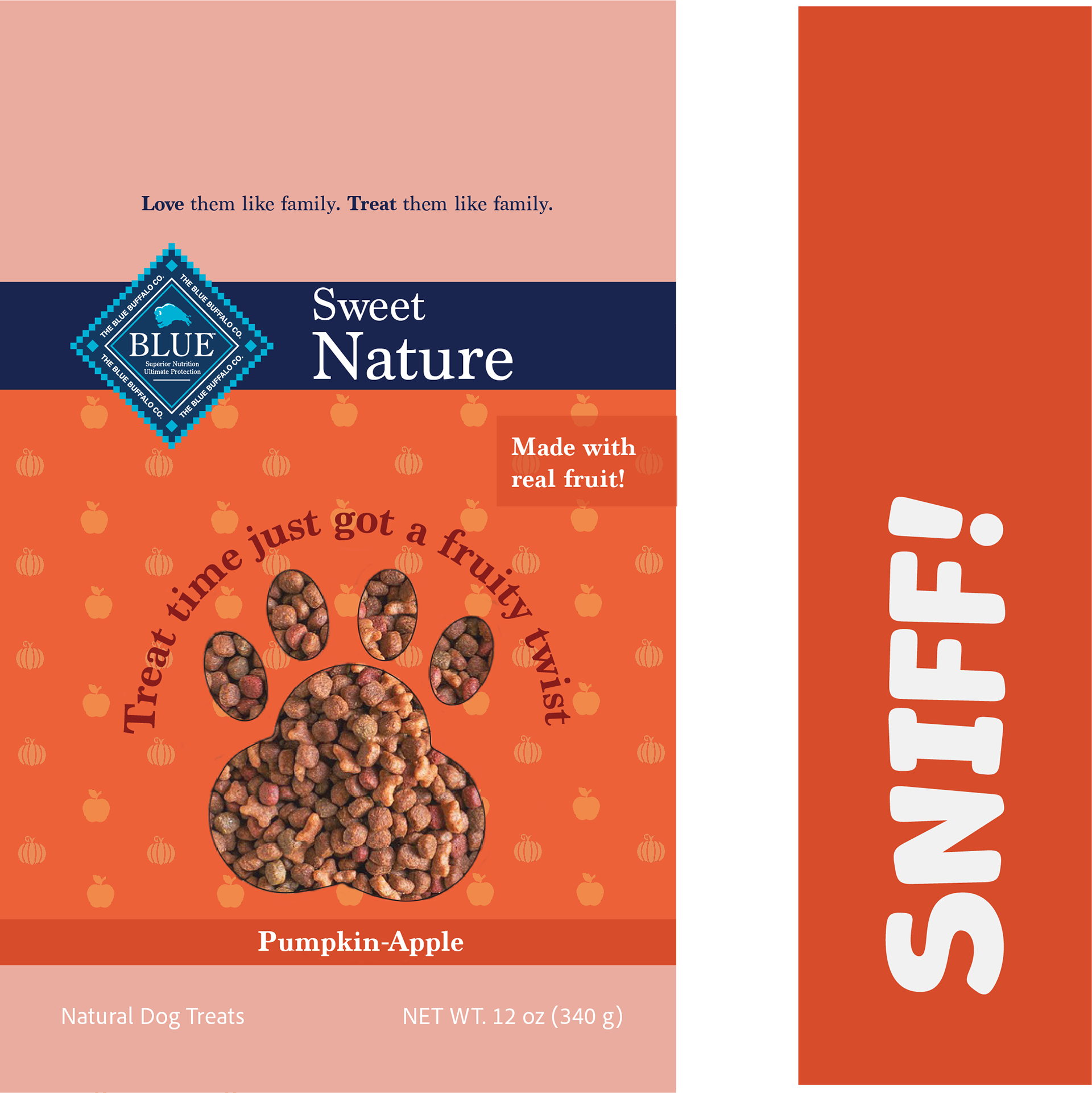
Blue Buffalo is a well-established and trusted brand in the pet food and treat industry, with a commitment to high-quality, nutritious products. For this project, I developed a new line of dog treats with a focus on promoting overall wellness and delivering various health benefits for dogs. The goal was to create a product that not only supports a dog's well-being but also adds an element of fun and enjoyment to their treat time. By incorporating natural ingredients and aligning with Blue Buffalo’s brand values, this new line, which features fruit flavors, as not many treats do, ensures that dogs get a healthy, delicious snack while reinforcing the bond between pet and owner through a rewarding experience.
This project was not about rebranding, but about introducing a brand extension. The goal was to create a new line of fruit-based dog treats that would feel fresh and playful while still aligning with the brand's trusted image and values.

Blue Buffalo’s target audience primarily consists of pet owners who prioritize the health and well-being of their cats and dogs. These individuals typically value natural ingredients, real meat, and wholesome nutrition for their pets, often seeking alternatives to traditional pet foods containing artificial additives or by-products. Blue Buffalo is for owners who are willing to invest in premium-quality pet food to support their pets’ overall health, vitality, and longevity; the products are more on the expensive side. Additionally, the brand also targets specific segments of the market, such as owners of pets with dietary sensitivities or those seeking specialized formulas for different life stages.


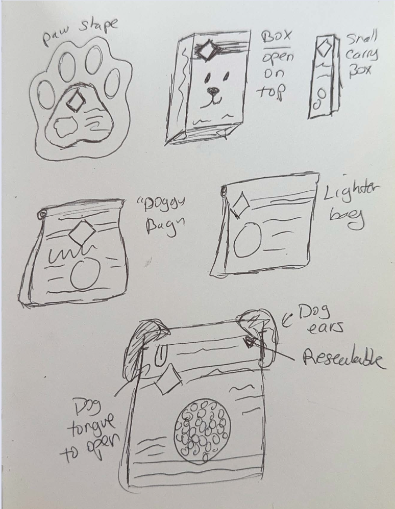
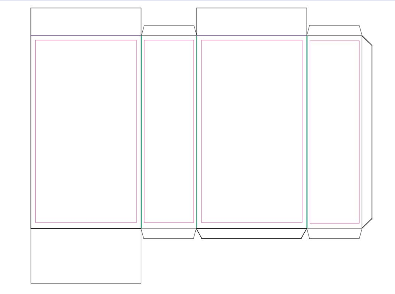
After creating user personas and researching various packaging, I sketched out some ideas, looked for colors, iconography and dielines that would be best suited for this brand extension
After going through the research and sketching phase, I chose bold colors and patterns to represent the different fruit flavors. The word "sniff" appears on the side of the packaging as a playful nod to a dog’s curious nature, and because the treats have a fruity scent that adds to their appeal.
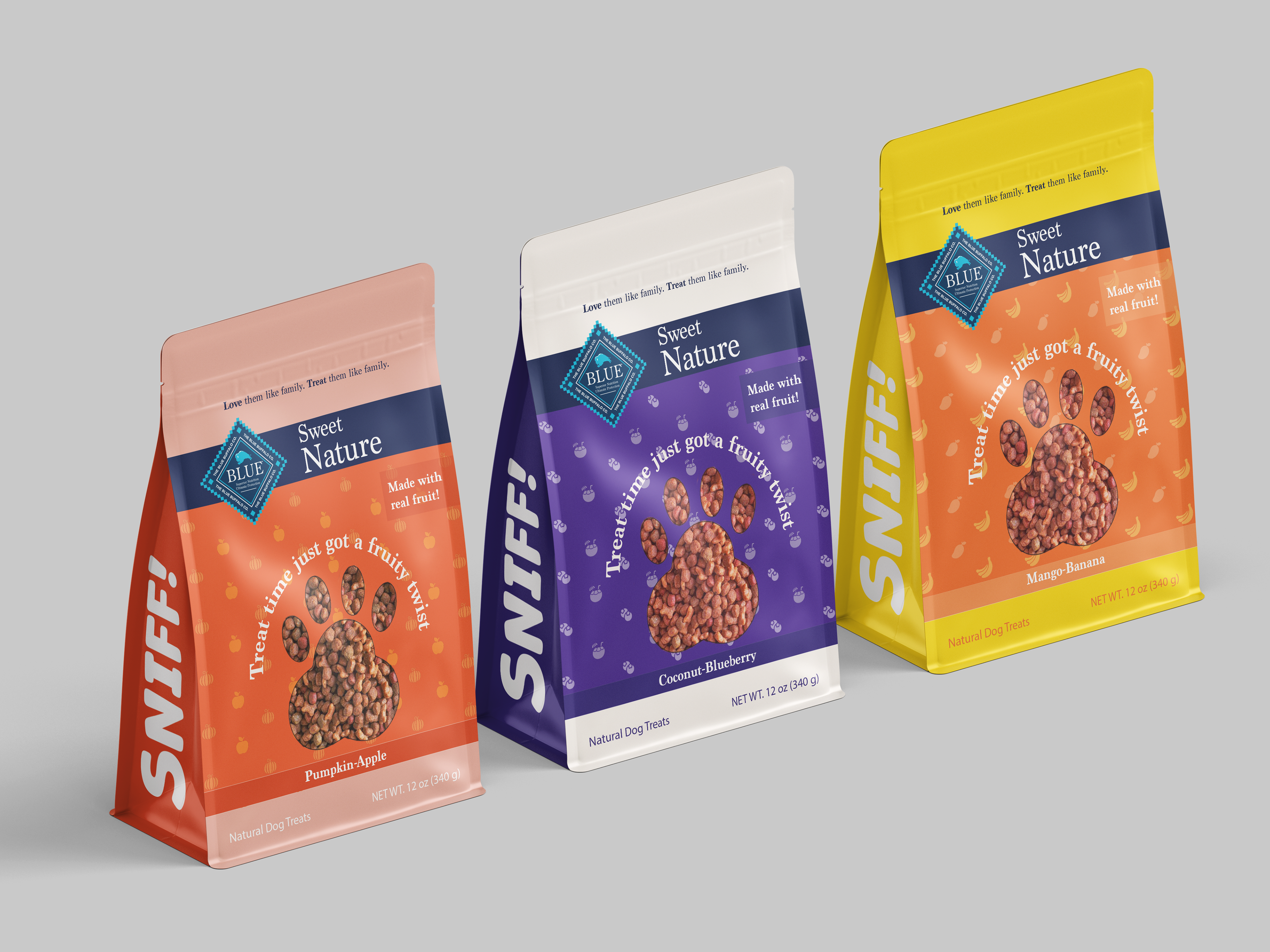
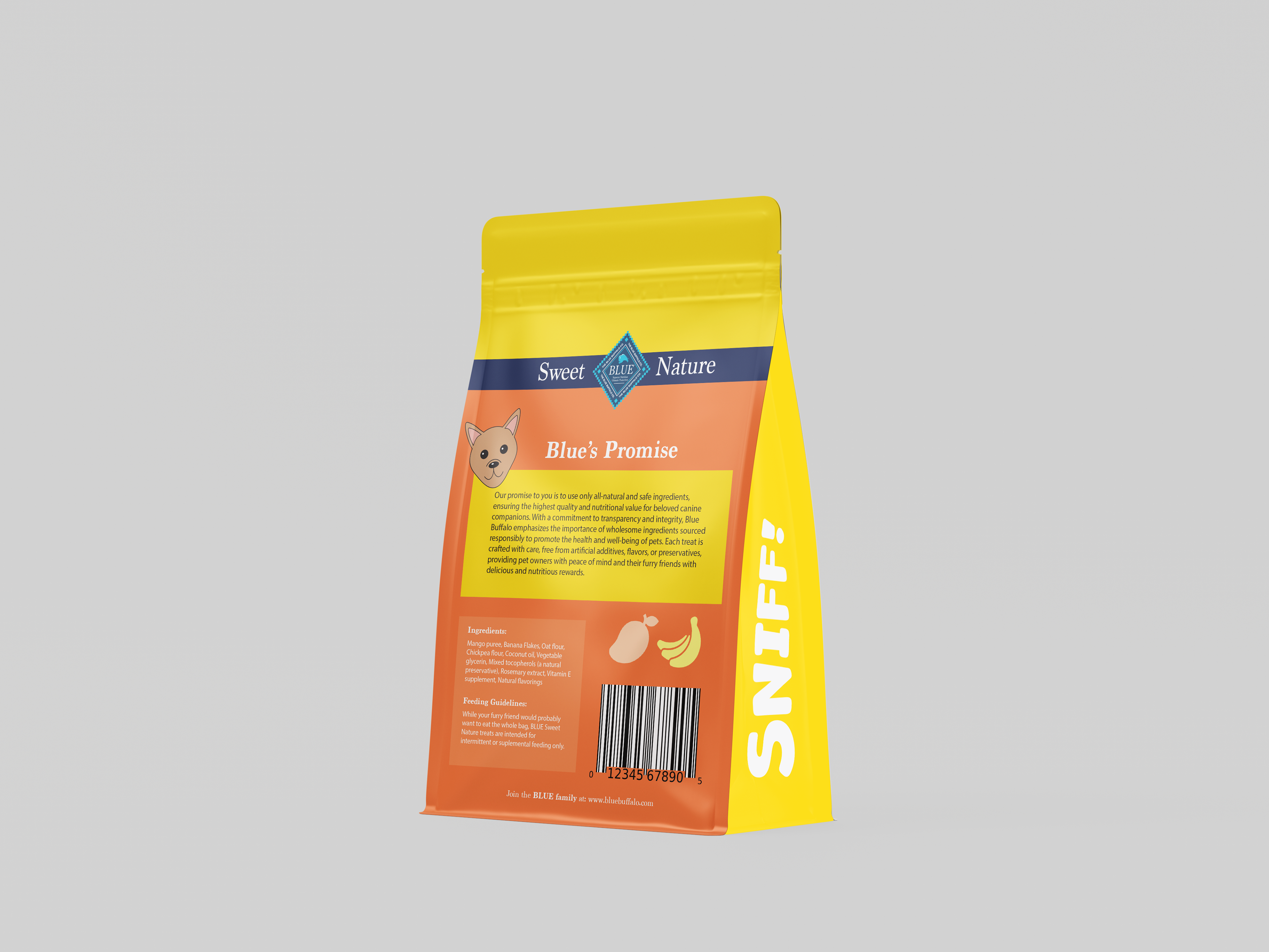
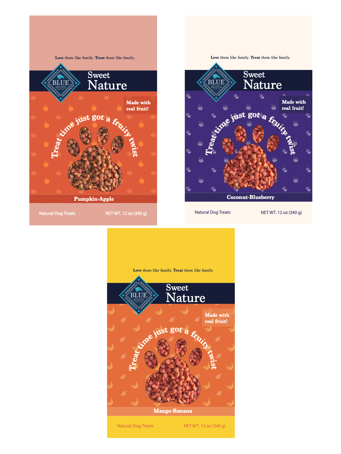
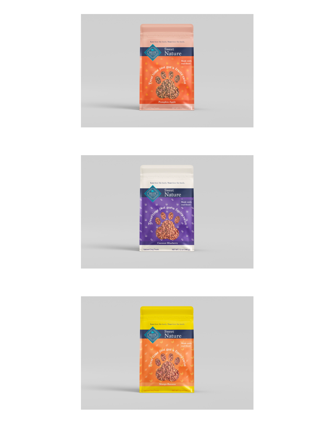
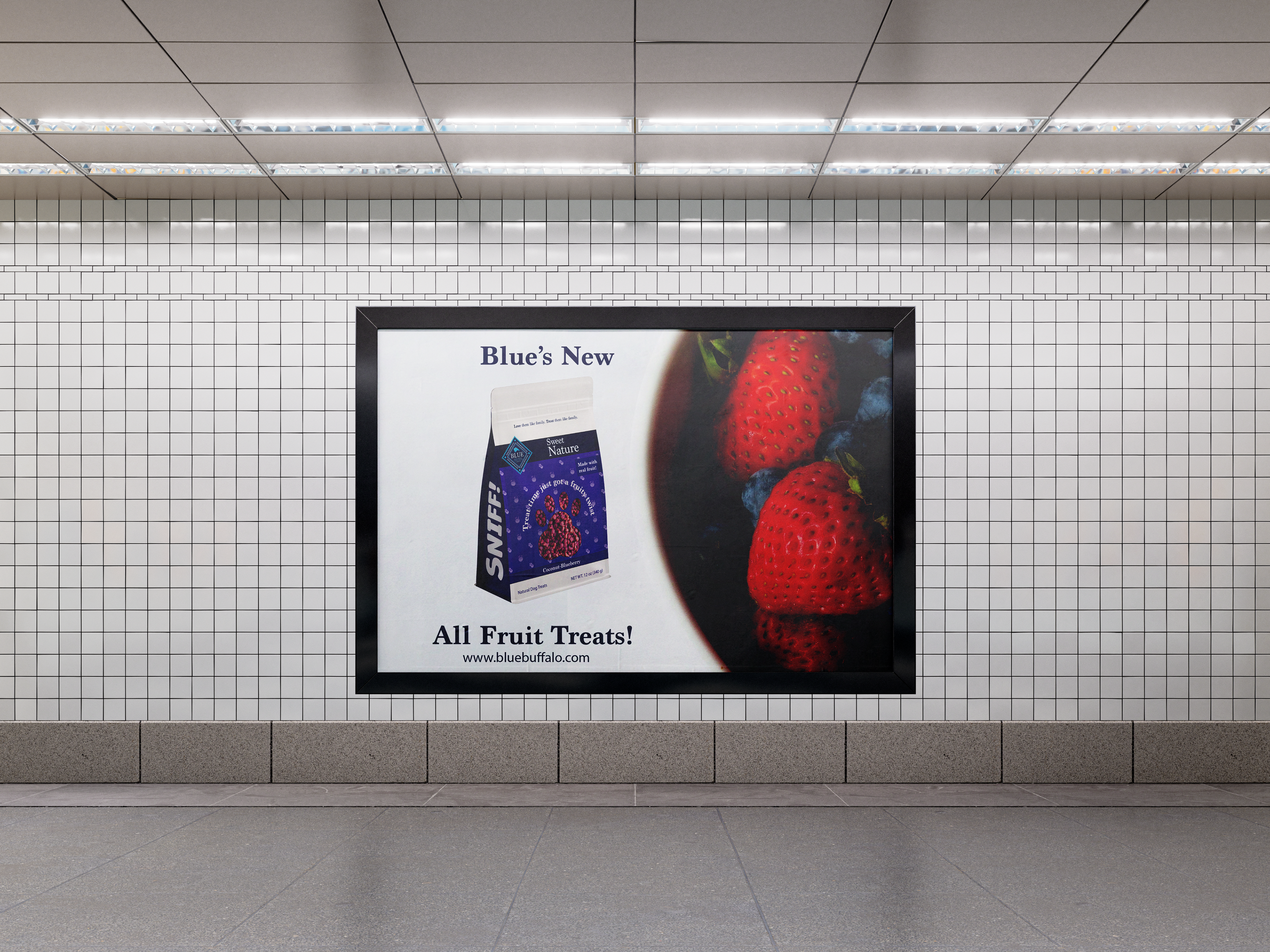
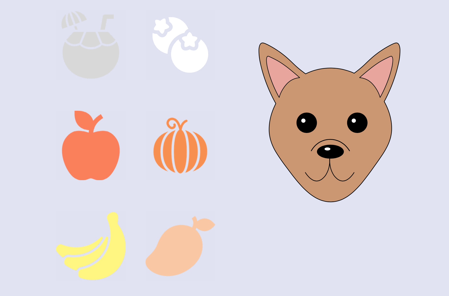
For the design, I chose to use vibrant, eye-catching colors to evoke the freshness and excitement of the fruit combinations featured in the treats. The bright hues were carefully selected to visually represent the natural, flavorful ingredients, creating a playful and appetizing appeal. The main fruit flavors in this line are unique, health-focused blends, such as pumpkin and apple, coconut and blueberry, and mango and banana. Each flavor combination not only offers a delicious taste but also delivers key nutritional benefits, and the bold, colorful packaging reflects the lively and wholesome nature of the product. This design approach aims to attract both pet owners and their dogs, reinforcing the idea that these treats are as fun as they are nutritious.